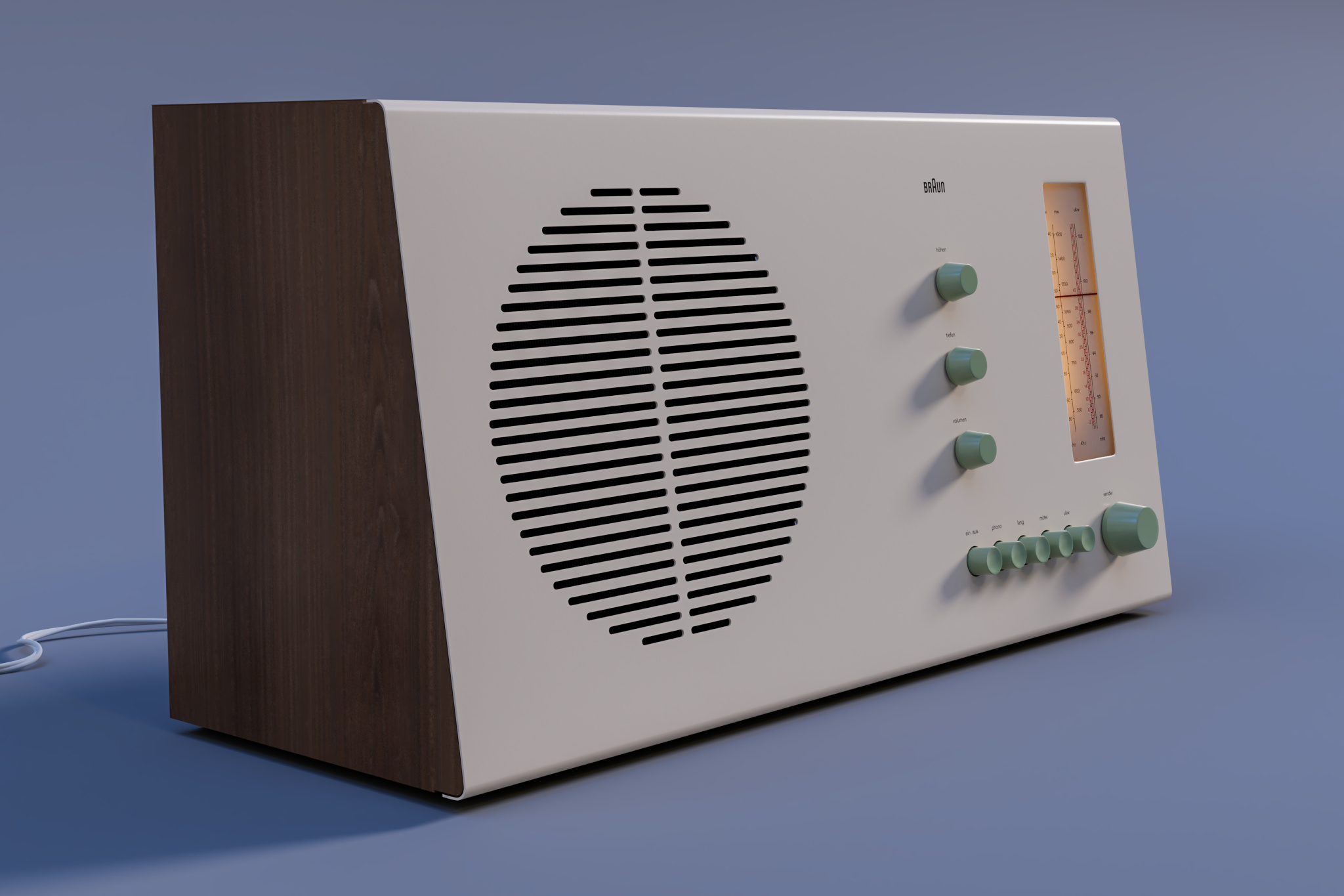
A relatively fast study of a Braun-RT20, which I did when I first switched to Blender 2.8. Rendered in cycles. ItTried to get close to the beveling of a model I could see in an antique shop nearby. Not absolutely sure about the strength of the interior light, as I could see it working only on some video on Youtube.


11 Likes
love it! nice modellin!
1 Like
Thank you masterxeon! I am a fan of your work, I need to try your tools soon - I have been working on some mecha work recently and I know hardops would allow me to “sketch” faster directly in Blender (I normally do it on paper, but I would like to combine the two).
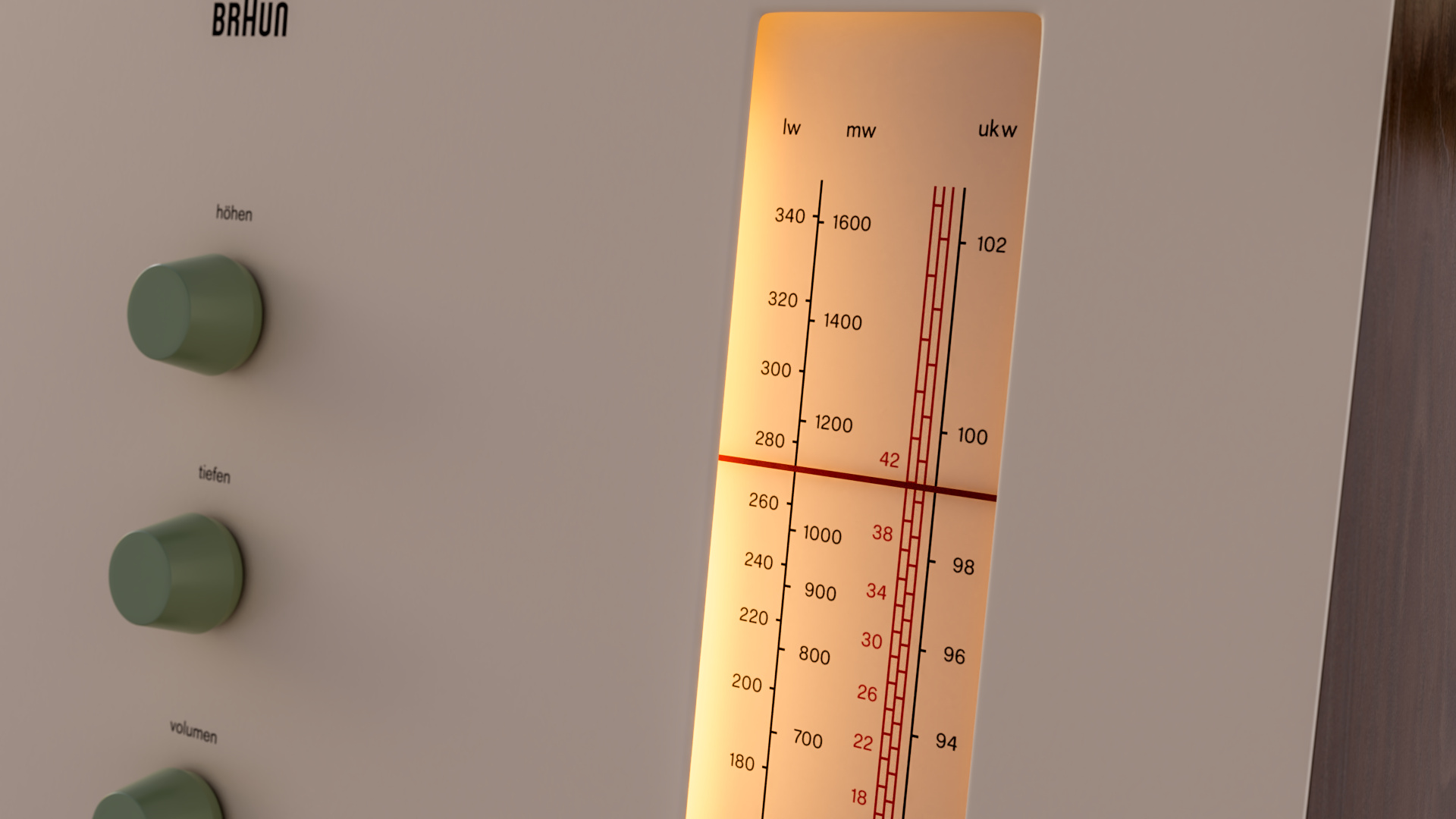
A detail of the dial in warmer light - I recreated the textures in photoshop using photoreferences. The fonts are as close as I could get to.
1 Like
thanks! Fundamentals are also essential so I don’t scrutinize workflow at all. The result is all that matters. The device you modeled has a quiet beauty to it. Its a reminder that the absence of detail is as essential as the detail itself. The close up is also very nice.
1 Like
Thank you!
I wanted to go back to something deceptively simple, and if you look at these old Braun designs you have a lot of work done to make things functional but at the same time to give this sense of balance and beauty you described. Also the back is beautiful and attractive, to me. And the work done on the tiny bevels, the feel they give to the buttons, is remarkable. The unit I saw in the shop had a dial that had been replaced and you could see the difference in the beveling and even in the level of subsurface scattering - it just felt “cheaper” than the others.
I did a bunch of these studies also to help with a mecha head and to try and clear up my mind.
1 Like
I featured you on BlenderNation, have a great weekend!
1 Like
Wow, thanks!
1 Like
Great deal of attention and care put into this, it comes across.
Very cool model! Your choice of color tone on the lighting really makes the render that much better.
Materials are also put together very well. Big fan of retro industrial product design myself.
1 Like
I like how you also did the backside… I kind of left that out in my model 
I had a similar experience with fonts when recreating the printing. The fonts used by Braun & Grundig back then are just not really available today. Sometimes it’s even more than one font.
1 Like
Thank you @Null_Dispatch and @tdudai !
Torsten, indeed, I got started for fun on the backside and got carried over. I even started doing bits of the interior but for a study it was becoming a bit overkill. I was using this to test different things in Blender 2.8.
And about the fonts: you are 100% right. The dial uses different fonts in the original, and for this I mixed a couple of fonts for the dial alone but it is still not completely right. I actually wanted to go as far as to ask some guy at a local design university but then I reminded myself not to overdo it, or I would never finish it!
Thanks again for all the replies and attention.
Hello! My name is Felipe and I am looking to do a similar project. I was wondering if you would be willing to share the .stl file for this project to help me with design. Please feel free to email it to me at [email protected]