(Cover for Fiction, #200 (August, 1970), ed. Alain Dorémieux)
Our adventures in French SF magazine cover art continue! A little more than a month ago I posted on Claude Lacroix’s Delicate Lines and Mutations and we press on in a similar manner with the art of Wojtek Siudmak, a Polish-born artist based in France.
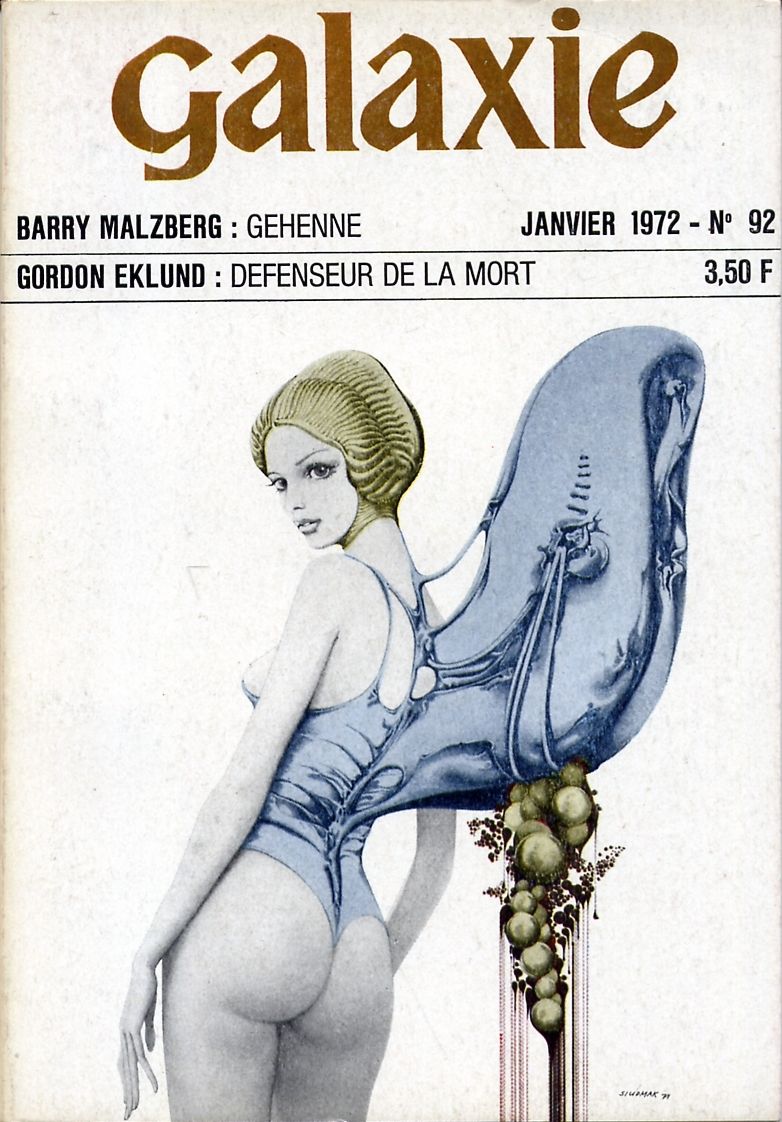
I am deliberately featuring only Siudmak’s first two years of cover art (he was very prolific): 1970-1972. Between these years he mostly illustrated the major French SF magazines Fiction and Galaxie. As I mentioned in the previous post, the 60s and 70s covers for Fiction—“the leading journal of science fiction and fantasy in France” until its cancellation in 2015—were characterized by simple color schemes and delightful line work. Siudmak adeptly works within these restrictions. He might best known for a prog rock album cover I’ve included at the end of the post—however I prefer his early cover work. A few of his surreal 80s paintings are brilliant—Les Temps comes to mind. His disconcerting 1970 cover for Fiction, #200 is my favorite due to the bizarre implications of the image. The odd growths and head-encompassing contraption on the young woman in Galaxie, #92 suggests unusual alien operations.
Deconstructed bodies, reconstructed bodies.
For a general history SF in France see SF Encyclopedia
Enjoy!
As always, thoughts/comments welcome! Do you have a favorite?
(Cover for Galaxie, #92 (January 1972), ed. Michel Demuth)

(Cover for Galaxie, #82 (March 1971), ed. Michel Demuth) 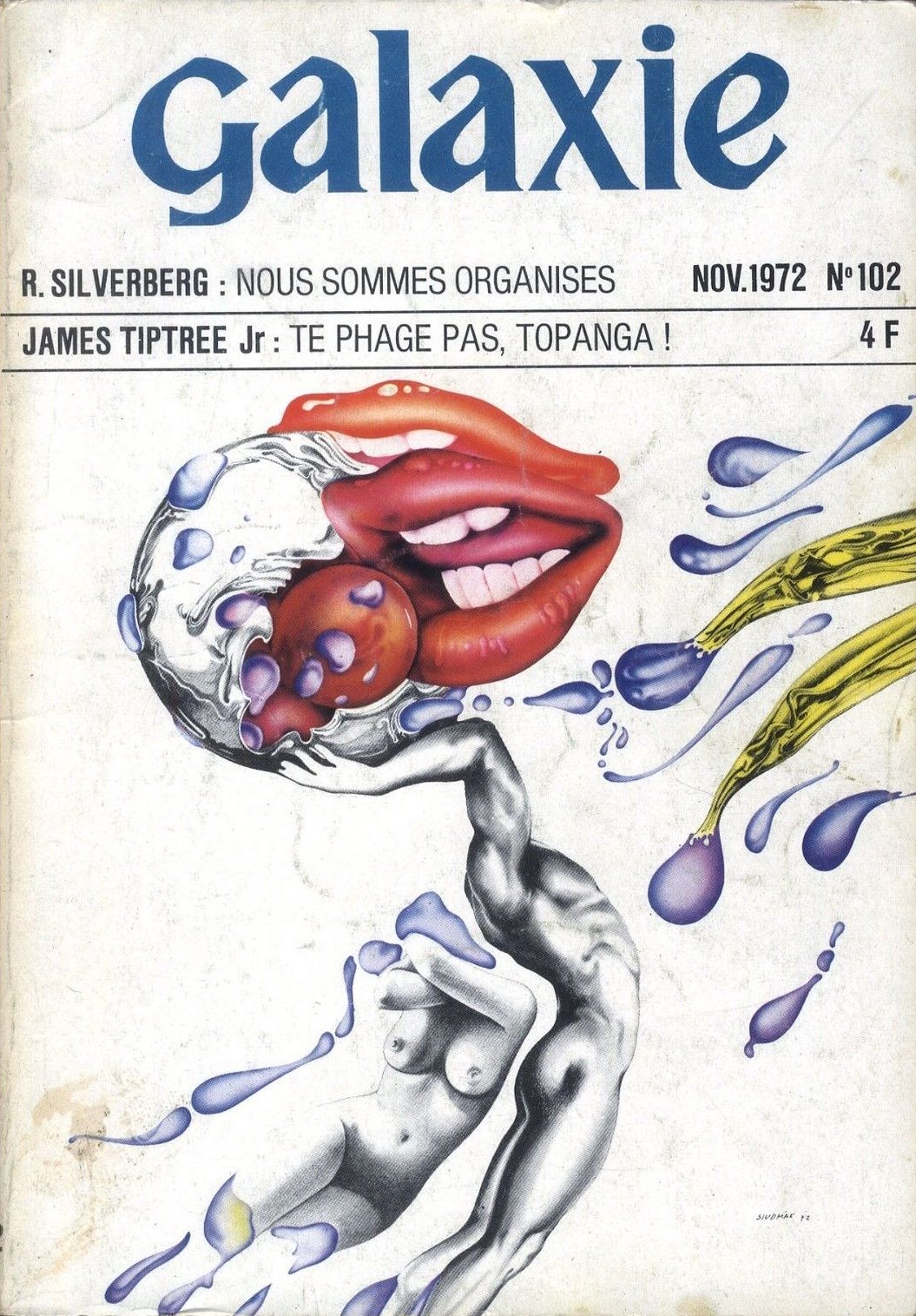
(Cover for Galaxie, #102 (November 1972), ed. Michel Demuth)

(Cover for Fiction, #195 (March 1970), ed. Alain Dorémieux)
 (Cover for (August 1972), ed. Alain Dorémieux)

(Cover for the 1977 album Ocean by Eloy)
For more cover art posts consult the INDEX

Striking images, but they feel very much of their time, and I’m not sure I find them particularly appealing!
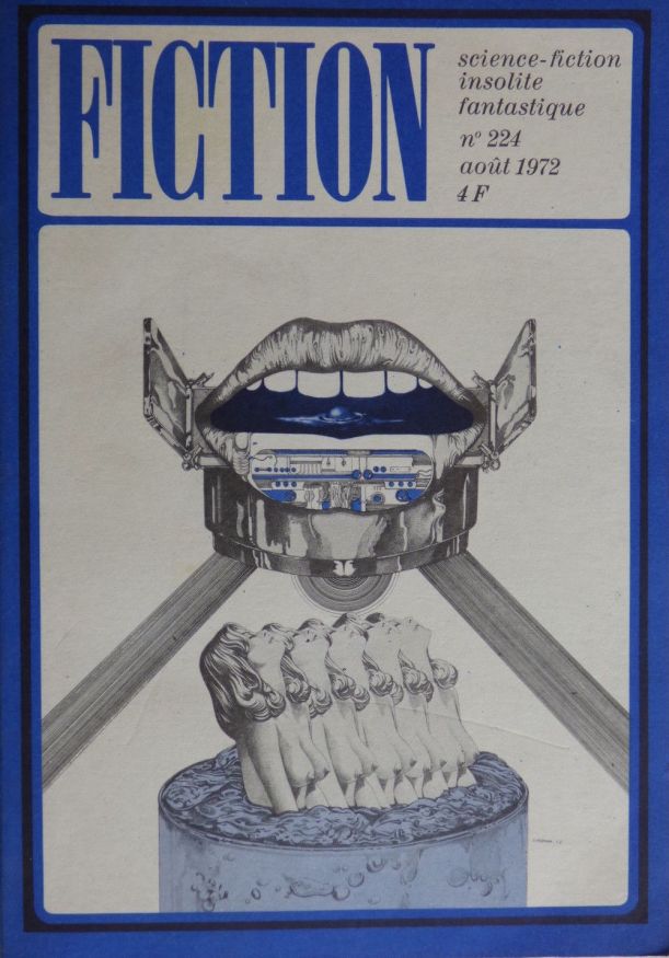
I enjoy them a lot. Perhaps because of how disconcerting they are…. What are those egg things descending from that blue protuberance on her back? Why is that baby head in the unusual helmet and what does the rest of its body look like beyond the page? They tempt, they tease, and they have a collage element — especially Fiction, #224 (August 1972) that appeals to me.
What you say,reminds me of the perplexity felt when looking at paintings of Rene Magritte,or even Max Ernst or Giorgio De Chirico.They don’t make sense,but their mysteries invite you to try and find answers,that can only be found in deeper meaning behind the disturbing surface.
That is true of these illustrations I think,and of much modern SF,that is uncertain and doesn’t provide easy answers.I think the artist tried to represent this here.
Richard, have a favorite?
No,I quite liked all of them I think,but I’ll have a look again.
Some marvelous artwork there, especially the first three covers. He may be well known in Europe but I don’t think I’ve ever seen any of his art before. Thanks for sharing.
Did you see the link to his painting Les Temps in the post? You might enjoy it. More indicative of his 80s style.
https://www.wikiart.org/en/wojciech-siudmak/time
I glanced through his listing and it doesn’t appear his covers graced any US/English lang editions. I didn’t know him until I started looking through the various 50s/60s/70s French SF magazines
http://www.isfdb.org/cgi-bin/ea.cgi?26029
Here’s a massive collection of his canvases. Many appeared on covers in various forms.
https://www.wikiart.org/en/wojciech-siudmak
I think my favourites are the ones with the baby’s head in the astronaut’s helmet and the girls who look like they’re emerging from a cake!If Magritte had been a cover artist for science fiction magazines,they would have looked like these,in his own style of course.
You’ve shown book covers adorned by his paintings,which seemed suitable I suppose for modern SF.
I like the more illustrative ones, especially the album cover. Love the bright covers on that one. His artwork reminds me of the comic artwork and the covers of the early issues of the magazine Heavy Metal. Do any of the magazine cover actually illustrate any of the stories?
I don’t know if they illustrate the stories. That said they definitely illustrate how inventive, bizarre, and uncanny many of the stories are inside of the volumes — Sturgeon’s “Slow Sculpture,” Malzberg’s “Gehanna,” etc.
Nice finds, Joachim! I like Galaxy 92 cover of the woman with the blue extrusion the best and Galaxy 102 next. The Wikiart link has a great selection of his paintings and drawings.
Yeah I didn’t know what to make of the Galaxie, #102 cover art at first. But I’m starting to enjoy its dynamism.
I couldn’t access the link you sent.Windows can’t find site with www.
It was a spam message. I deleted it. I wasn’t the poster….. You’ll notice that it quoted your words in order to get past the filter.
No,I know you weren’t.I wondered why it wasn’t by my comment on your site.It’s alright then.
Thought it was a bit strange.
Unfortunately I get thousands of spam messages a day and sometimes they creep through or other people’s message are picked up by the filter accidentally.
Yes I did,so the link was bogus too then?
Yes Richard, just a spam message…
I appreciate the work you put into this blog.
Thanks! Have a favorite cover from the post?
Brilliant stuff! I didn’t know of him, before – thanks….
Have a favorite from the post?
Incredible. Wonderfully surreal.
I like the angel winged girl for obvious reasons lol.
The baby head looks like he don’t take any shit and is most definitely a tyrannical overlord somewhere in the galaxy!
Super stuff. An amazing fantastic historical site you have Joachim.
In the 80’s, his works were used, among others, for a syfy paperback collection “Pockett SF” (editor: Robert Laffont). In the 90’s the collection design was remold and Siudmak became the sole illustrator, still known as the “silver covers”. Buyers enjoyed so much the covers that they added a postcard sized reproduction of the cover without text on it. Today, it’s common to find them in bookstores, but the reproduction is often retrieved.
I discovered Syfy literature by this collection, great times.
I must confess, I despise the design of those silver cover 80s/90s French volumes. I rather the art be more prominent on the cover. And sometimes, the cutting of the art was egregious. This is a fantastic example:
http://www.isfdb.org/cgi-bin/title.cgi?1620682
His art is ruined in the 1990 edition.
The silver cover was a good marketing trick because it made the collection more recognizable in the bookstores.They catch the eye quickly. Finding a reproduction of the art page two was a great add-on. But it was a poor idea to print the first lines of the text on the cover. The 90s design made the book more as a special object, the former design was more a common book with a beautiful illustration.
I’m not objective because the silver cover is linked to great memories in my mind.
I guess a UK equivalent are those horrid yellow Gollancz volumes — with no art… but highly recognizable!
Absolutely. I understand completely the power and nostalgia wrapped up in those formative memories.