


How to Add Text to a Photo on iPhone Using Markup & Visme
Written by:
Chloe West
Coming up with a color scheme—whether it’s a new logo color scheme, colors to use inside of an infographic or a color palette for your upcoming presentation—is hard.
While in many instances, you’ll simply use your company’s branding to guide your design colors, there are cases you want to branch out and find a different palette to use.
Even the most seasoned designers can struggle with picking the colors to go inside of a new design because they have to find palettes that match and keep color psychology in mind along the way.
This is why we put together this roundup of 50 eye-catching logo color schemes to help you find inspiration and understand the different color palettes that work well together.

Regardless of if you’re starting a new company and in need of a logo, looking to rebrand or simply looking for color scheme inspiration, we’ve got you covered.
Before we dive into the 50 logo color schemes and best logo color combinations we’ve gathered, let’s talk about how you can choose the perfect color scheme for your new logo.
Different colors mean different things, and it’s good to have an idea of what color schemes are often used in your industry.
Even if you’re rebranding, trying a new color scheme might be the way to go if you’re looking to change your company’s image.
Here are a few tips when it comes to finding the perfect logo color scheme.
What kind of message do you want to convey with your brand voice? Is your company friendly and relatable? Informative and authoritative? Sassy and bold?
Knowing how you plan to direct your messaging can be a big factor in choosing brand colors that help to convey that brand voice and personality.
For example, yellow can convey friendliness and optimism while blue can convey trust and intelligence. A less serious brand would incorporate yellow into their brand colors, while more serious companies like health insurance and financial institutions would use blue.
Paying attention to the color schemes that your competitors are using in their logos is a great way to gain a better understanding of the colors used in your industry.
This can also help you determine if it would be safer for you to use similar colors to blend in, or try something different to stand out.
As I said earlier, colors mean things. They can have positive and negative connotations based on the tints and shades, and you don’t want to convey the wrong message in your logo.
Make sure you have a thorough understanding of color psychology before choosing your logo color scheme so that your brand emits the perfect message.

Of course, we had to include our own brightly colored logo in here! As a graphic design software, we wanted to bring as much color to the table as possible.
And while you won’t see all of these colors overwhelming you in our design dashboard—we tend to keep that very neutral with our dark blues—we love having these as secondary colors inside our logo to give us a pop of color and help us to stand out.
Slack is an online communication tool that many remote teams and collaborators (like us here at Visme!) use to stay in touch with each other.
Its brightly colored logo stands out nicely against the deep purple of their interface, making the app easy to find in one’s phone or browser.
I personally love a good multi-colored logo like this as it gives brands the opportunity to play with color in unique ways, rather than being boxed in by one or two main shades.
FedEx is an iconic logo, all the way from the hidden arrow to its bright and in-your-face orange, purple and white color scheme.
Not many people would put orange and purple together in a design, but the combination of a bright orange and a deep purple works perfectly for this recognizable brand.
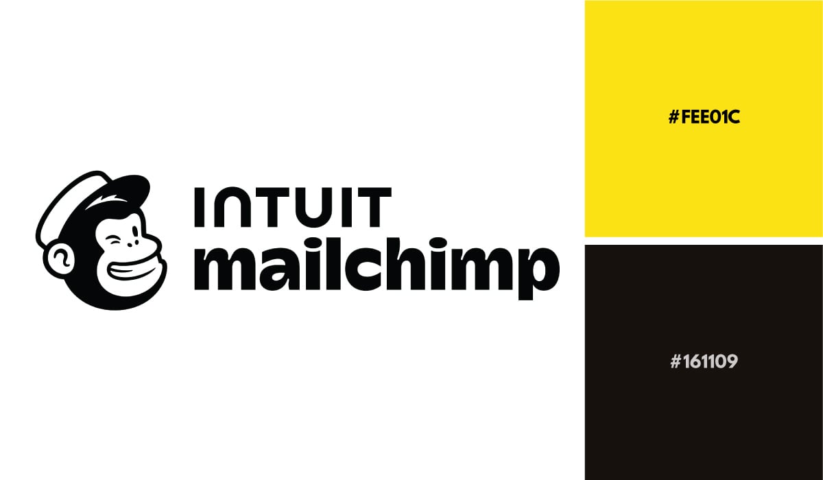
The eye-catching yellow in Intuit mailchimp’s recently rebranded logo color scheme is perfect for a tech company. The email marketing platform utilizes this yellow and black color palette beautifully to both grab attention, and keep their designs succinct and on brand.
Who says beer companies always have to be brown, green and blue? This bright and ombré pink to orange Lo-Fi Brewing Company logo is sure to stand out among competitors in the cooler section of the grocery store.
Sometimes, breaking away from what most other companies in your industry do can be a great way to stand out and get people looking at your brand.
Upstart is a personal loan company, which is no surprise when we take a look at this muted color palette. Most financial companies tend to have a muted blue or green hue in their logo, and this two-tone teal is perfect.
Football fan, anyone? The Miami Dolphins have one of the most eye-catching logos with their teal flat-design dolphin in the middle and a bright orange sun surrounding it.
If you’re looking for a winning logo color scheme, pairing a more muted tone with a bright color can create a great balance.
Sometimes all you need in life is a good monochromatic logo color scheme, which is exactly what social media management software Sprout Social has put together.
This logo design and coloring makes sense for a brand whose name mentions greenery. While green logos can sometimes symbolize nature or eco-friendliness, that doesn’t always have to be the case, as proven here.
MasterCard recently rebranded to create a more modern version of their well-known logo, while still keeping the same logo color scheme they’ve had for years.
This warm color palette has helped MasterCard to become as instantly recognizable as it is, and they created this iconic logo with just a couple of shapes. You can create your own similar logo using the geometric shapes available right inside Visme!
Another fun rainbow logo color scheme comes from the network NBC! Their colorful peacock logo was designed to showcase the TV network introducing color TV to its viewers.
Think about how your own logo’s color scheme can represent a product or service that your business offers, similar to NBC’s original mission.
You can’t go wrong with a brightly colored logo like Dunkin’ when you’re trying to grab your audience’s attention. This bright orange and pink color scheme is sure to wake you up in the mornings, just like their coffee and donuts.
This unique logo features a gorgeous pastel color scheme of aqua, purple and coral, and is a great one to emulate if you’re looking for a more muted tone of voice in your branding.
Just like many brands that have been around for decades, Best Buy has also recently rebranded to a more flat and modern design.
However, they’ve still kept their bright blue and yellow logo color scheme. They just faded out the black outline they used to have around their text and price tag. Their yellow is now more of an accent color as well, with the blue and white taking precedence.
Airbnb’s logo color scheme is simple and to the point, but this can often be useful with branding.
If you find a single color that you feel really represents your brand, you can easily pair it with blacks, greys and whites throughout your designs, allowing your main brand color to really shine.
Panera’s logo color scheme might not necessarily be the sexiest, but it’s instantly recognizable. Pair their olive color with their brand fonts, and you can spot a Panera ad from a mile away.
And regardless of whether you love their olive palette or not, that’s really what branding is all about.
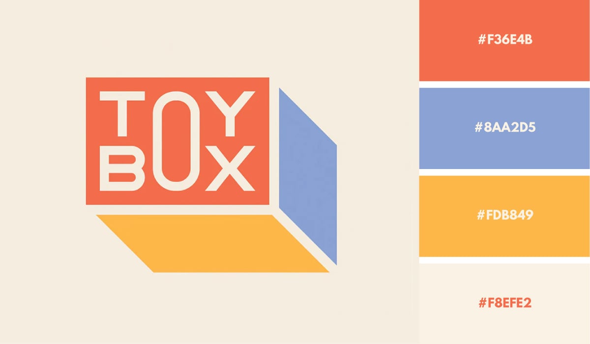
The ToyBox logo is a colorful 3D composition with pastel primary colors resembling a cube. The shadows give the logo depth and lots of personality. This logo color palette is bold and comfortable at the same time.
Pampers is another great example of a logo mixing together warm and cool colors. This aqua and yellow-orange pairing is a great way to grab your audience’s attention.
Sometimes, the perfect logo color scheme is almost all one color, with a simple accent of a second color to offset it, like with this Expedia logo.
Creating this accent in your logo can also help to guide your other branding and marketing materials. If you already know that you’re going to have one bright color be a small accent, it makes your overall design much easier.
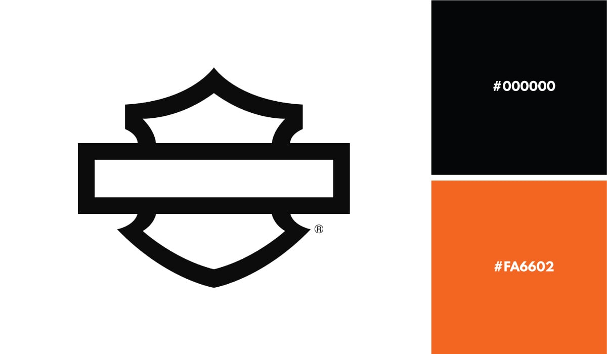
Harley-Davidson is another well-known brand with a recognizable logo shape and color scheme. It’s so recognizable, in fact, that they’ve removed all text from the badge and left only the shape. They’ve also added a new wordmark, which they use on their website and other media.
The Harley-Davidson logo is so iconic that many loyal customers and fans have even gotten tattoos of the logo.
The Hyatt Place is another great example of a colorful logo. They use different colored circles to create an H, with black circles representing the spaces in the letter.
This is a creative use of color for the hotel brand, making a simple geometric logo seem more involved.
Airtable’s logo uses different tints and shades of the three primary colors—red, yellow and blue. This is a great way to incorporate a tried and true color scheme into your logo.
When speaking of logo colors, few are as memorable as the Tiffany & Co. logo. The iconic turquoise blue is such a big part of the brand, that it’s been trademarked as such.
Billie is a women’s razor company, and their pastel logo color combinations help them resonate with the audience they’re targeting.
Keeping your target audience and their favorite color schemes in mind is a great way to start your new business or rebrand off on the right foot with your potential customers.
Drip’s bright fuschia logo is another example of how a single main color can really help your brand to stand out.
Whether you choose a neon color like Drip did or a more muted tone line we saw in Airbnb’s logo, finding one single color to represent your brand can have a really strong effect if you do it right.
We’ve got another multi-colored rainbow logo with Brandwatch. These types of logos are always eye-catching, and there are so many different ways to take advantage of rainbow colors.
Choose a brighter version like NBC or a more subdued palette like you see here in Brandwatch’s logo color scheme.
Gorjana is a feminine jewelry company and their tan/gold and white color scheme helps to visualize the quality and high-end feel of the brand.
Monday.com is a project management software, and its traffic light logo color scheme is very relevant to the idea of moving things along.
Figure out if you can create a color scheme for your brand that abstractly relates to your company and what it does in a similar way.
Here we have a mostly black logo with just a couple of orange accents. This can help the brand feel serious and important, while still giving it a playful edge with that pop of color.
Tableau’s logo color scheme is also multi-colored, but leans more blue in its shades. Even the warmer shades feel a bit understated.
As I’ve mentioned before, multi-colored palettes can be fun to play with because there are so many different ways to use them. You will see several throughout this roundup.
Some logo colors don’t need to be flashy and bright to be effective. The Investopedia logo, for example, has two dark colors and an accent color, just enough to make an impact and also be memorable.
Ahrefs is an SEO software that uses search engine data to guide its customers’ content strategies. It’s also extremely helpful in helping its users track their backlink data.
This is why it’s important to pay attention to the way they’ve used color in their logo. A typical link HTML tag is <a href=”></a>, and they’ve used a separate color to differentiate the “a” from the rest of the name to acknowledge the space within the tag.
Modern and contemporary office furniture brand Poppin is another great example of using a single bright color to stand out. Their website also takes advantage of this bright hue, making online shopping a fun and colorful experience.
The logo for DirectTV Go is a powerful example of how contrast can do wonders for a logo’s color scheme. The two-toned blue in the D gives it a 3D quality and the G’s terminals match the shape of the D. Blue and orange are complementary colors, making this logo stand out and make a strong visual impact.
Hello Fresh is a fresh food subscription box, so it should be no surprise that they’ve incorporated a lot of green into their logo.
Remember that bright greens tend to symbolize natural, eco-friendly brands, and it’s a great color scheme to use if your brand focuses on that.
The timeless combination of black, white and an accent color always works wonders for a logo. In this case, the accent color is a tree that also replaces the A in HAPPY.
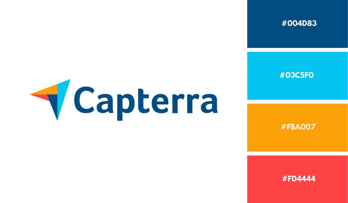
The logo for Capterra is a browser arrow made up of four isosceles triangles in different colors. You can see the distinct shapes but you can also feel the symbol as a whole. Having four colors in your logo offers lots of freedom for how you use them in your branding.
Firefox is a web browser by Mozilla. Originally a very distinct fox encircling the earth, the logo is now a gradient composition that visualizes the company name exactly.
Many companies stick to dull color palettes. But Firefox’s bright purple and orange color scheme helps it stand out from its competition.
Another way to do a single color scheme is by finding a dark shade that you can utilize within your logo and branding. This technique helps the real estate company CBRE seem serious and informative.
OptinMonster is another marketing software that has utilized some bright shades as well as an adorable little monster within their logo. Creating a mascot logo while still sticking with your color scheme can be a great way to strengthen your brand.
I love a good hot pink and yellow color scheme, and Amy Poehler’s Smart Girls initiative has hit the nail on the head with this guy.
If you’re trying to create an online presence that really grabs attention, a bright logo color scheme like this one is a great way to do so.
While many financial institutions stick to trustworthy colors like blue and green, you will also see a lot of healthcare and insurance companies do the same, like we have here with Health IQ.
Blue resonates with people and makes your company feel honest. Pairing that with a muted green and grey in their logo is a safe bet for this brand.
The Human Rights Campaign uses a nice combination of navy blue and bright yellow to ensure the focus in their logo is on the equals sign.
Using colors strategically in your logo can help you to place emphasis on different shapes, symbols and messages.
Pantheon’s logo is another example of using an accent color in an otherwise greyscale logo color scheme.
Find a way to create your own accent within your color palette. This can also give you an edge when creating other branded items, like your website and marketing materials, because you’ll already know which color is a secondary accent shade.
CoverageBook has a very subdued logo color scheme here with a pastel pink and a dark teal mixed together. This pretty color combination helps them to create some eye-catching graphics for marketing.
Here’s another great example of using a dark blue shade in a way that grabs attention. This blue and bright orange corporate color palette is stunning, and Cision’s use of geometric shapes in their wordmark logo gives it a playful edge.
Who can ignore the iconic logo color scheme of Reese’s?
From the candy bar to cereal to Reese’s pieces where the candy itself takes on the color of the logo, this chocolate and peanut butter candy brand has created a color scheme for the ages.
I love tasteful simplicity in a logo, and Asana has nailed it with their minimalist circles. The subdued red hue inspires a calm demeanor, perfect for being productive and concentrated. This red is not too bright, making it urgent and passionate; nor is it dark, making it broody and deep. It’s the perfect red for Asana.
Preview is an Instagram feed planner, hence the square pattern of its pictorial logo. The squares and colors represent a bright and perfectly curated Instagram feed, and we’re loving their use of color here.
Later is a social media management tool that’s incorporated a shape made up of bright blue squares and empty spaces into their logo.
Later’s logo before this one was made up of several colorful squares that frame the L and top right of the logo. The rebranding is a simpler approach to the same idea.
Last, but certainly not least, we have a monochromatic blue logo color scheme. Blue highlights trustworthiness, as we’ve drilled into you throughout this article, allowing this company to assure its users that their data is accurate.
Found a logo color scheme that you love? Use Visme’s color picker to find one similar, or grab the hex codes and drop them right into your Brand Kit to access them over and over again.
Additionally, use the AI Image Generator and prompt it to create graphics with the colors in your logo. Even if you don't have logos, use our logo maker to create one quickly.
Create your own free Visme account to start using these colors inside your own designs. We can’t wait to see what you come up with!
Design visual brand experiences for your business whether you are a seasoned designer or a total novice.
Try Visme for free

About the Author
Chloe West is the content marketing manager at Visme. Her experience in digital marketing includes everything from social media, blogging, email marketing to graphic design, strategy creation and implementation, and more. During her spare time, she enjoys exploring her home city of Charleston with her son.